
Until I was doing it for my real-life grown-up job, I never put much thought to the art behind typesetting. Newspapers, magazines, books—I thought they all just came that way. But there are so many decisions to be made about the best fonts for books, from the typeface itself to the type size, the space between lines, the amount of lines per page, and so much more. Where do you even begin?
Book interiors are something you probably don’t think much about. Covers are the attention-grabbers. They’re the trendsetters. The interiors, where you spend the most time, are meant to be smooth and seamless. The job of the typesetter is to be invisible and create an immersive reading experience—you don’t want the reader getting ripped out of the story because of an unreadable font. That’s why choosing the right font for the body of your book is so important.
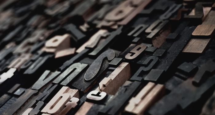
The Best Fonts for Books
When choosing the best fonts for books, you most likely want to stick with a classic. Jason Tselentis, graphic design and typography teacher, shares the history of typography in his book Type, Form & Function: A Handbook on the Fundamentals of Typography and suggests you keep it simple if you’re laying out a book. “Classic typefaces such as Old Style fonts Caslon, Bembo, and Garamond work well for text type because they have not only stood the test of time, but were also invented for the purpose of uninterrupted reading.”
And that, in essence, is the goal of typesetting: uninterrupted reading. If a reader notices a font, there’s probably something off.
Book designer Ingrid Paulson, who does freelance book design alongside publishing classics at Gladstone Press, knows her fonts. She says she can sometimes recognize them in the wild, but “I just want to enjoy the book, so if I notice the font, it means something isn’t quite right.”
Paulson also teaches book design and said she focuses on getting her students to train their eyes to spot the subtle differences in fonts, and also to pay attention to legibility.
“They may think that Garamond or Baskerville are a bit boring or old-fashioned, but we try to steer them to those classics over using something harder to read such as Times or Bodoni,” Paulson said over email.
Paulson’s go-to fonts are serifs, and she has fun getting to know their individual quirks: How to get to the “sweet spot” of 66 characters per line, and how wide that line of text would have to be. Whether a typeface includes all the diacritics—accent marks, fractions, old style numerals—she needs for a book. How large certain characters, like quotation marks, are and how they will affect the final page count.
“I know it sounds odd, but those text typefaces do carry a certain personality, so I need to look in my toolbox and figure out what typeface would suit a business book, or a novel, or poetry,” Paulson said.
Basically, the best fonts for books are simple and classic. A flashy font works great as display type—that is, chapter headers, part openers, and any other large type—or a call-out like a pull quote, but is exhausting on the eyes to read for more than a few words at a time.
Vyki Hendy of Spine Magazine also prefers a classic like Garamond. “Serifs are definitely easier to read on the printed page. Personally, I have a fondness for Garamond Pro; it’s just so elegant,” she said.
The plus side: The classics are probably default fonts on your computer, so you don’t have to shell out wads of cash for them if you’re designing your own book. For example, Bembo, one of my favorite body fonts that isn’t standard on devices, is upward of $200 for the entire family, including bolds, semibolds, extra bolds, and italics.
Fonts have a lot of personality, and that comes into play when laying out a book. I like to set historical fiction in Caslon, because it’s an older style and has that older feel to it. For academic books, something small and elegant would suffice—Jenson is beautiful. For kids chapter books, go with something classic with pronounced edges—I like monospaced-esque fonts like Chaparral.
The Elephant in the Room
Which brings us to Comic Sans. I would be remiss if I didn’t talk about the font the internet loves to hate. Sure, it’s goofy and juvenile and simple. But that’s exactly why it’s necessary in any font library. It can be helpful for people with dyslexia, because each letterform is so pronounced. Hating on it is actually a form of ableism, according to The Cut. So be cool about it.
Creative Market did a deep dive into a study about if Comic Sans is helpful for dyslexia and wrote this one very profound line: “Never forget that typography is so much more than decoration. It’s a functional tool that you should wield with great care.”
The design blog analyzed information from a study to see what fonts are easier for people with dyslexia to read. The study focused on fixation time (how long a reader spends on passages), and concluded that italic fonts get a lot of fixation time, while sans serifs, roman fonts, and monospaced fonts (like Courier, or other fonts that look like they were created on a typewriter) get less.
Unfortunately, Comic Sans wasn’t one of the fonts sampled in this study. But the information from the study—the wider or roman fonts are more legible—alongside anecdotal data can suffice here, I think.
How to Find Out What Font a Book is Set In
If you find yourself in love with a certain book’s typeface, there are a few places to find that information. The first is on the copyright page, which might say “Set in Times LT Pro Roman and Digi Grotesk LT,” as in Hank Green’s An Absolutely Remarkable Thing. Some books have a colophon page at the very end of the book, giving more information about the typeface used throughout, along with other production information. Esmé Weijun Wang’s The Collected Schizophrenias has such a page, listing the font, book designer, and printer and paper information.
The Short Answer
The short answer to the question “what are the best fonts for books?” is Garamond. It’s classic, versatile, and likely came pre-installed on your machine. As with all art forms, start with the basics and once you know your way around those, you can move on to the fancier things. Like Zapf Dingbats. (Just kidding!)
Good luck on all your book designing endeavors, friends.